Website Conversion Rate Checklist: 7 Steps to Turn Visitors into Clients in 2025
Are you struggling to convert website visitors into paying clients? You’re not alone. Studies show that the average website conversion rate is only 2.35% across industries, meaning most visitors leave without taking action. But with the right strategies, you can boost your conversion rates and grow your business. This website conversion rate checklist provides seven actionable steps to optimize your site, backed by expert insights and real-world examples. Whether you run a business website, blog, e-commerce store, or service-based business, this guide will help you keep visitors hooked and turn clicks into customers.
Table of Contents
Why Website Conversion Rates Matter
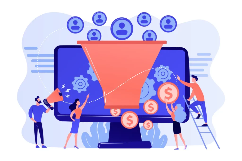
Before diving into the checklist, let’s understand why conversions are critical. A conversion happens when a visitor completes a desired action, like filling out a contact form, making a purchase, or signing up for a newsletter. Higher conversion rates mean more revenue without increasing traffic. For example, if your site gets 10,000 visitors monthly at a 2% conversion rate, you gain 200 clients. Boost that to 4%, and you double your clients to 400 without spending more on ads.
Low conversion rates often stem from unclear messaging, poor design, or technical issues. This website conversion rate checklist addresses these pain points, ensuring your website is built to convert. Let’s get started.
The Ultimate Website Conversion Rate Checklist
Use this seven-point checklist to audit and optimize your website. Each point includes practical tips, examples, and tools to help you implement changes effectively. Aim for a perfect score of 7/7 to maximize conversions.
1. Clear Headline: Communicate Your Offer Instantly
Your homepage or main landing page needs a headline that tells visitors exactly what you offer in one short sentence. A vague or overly clever headline confuses users, causing them to bounce.
Why It Matters
The headline is the first thing visitors see. It should answer, “What’s in it for me?” within seconds. Research shows that 80% of users only read headlines, so clarity is key to keeping them on your site.
How to Optimize
- Keep it concise: Aim for 6-12 words. Example: “Affordable Web Design for Small Businesses.”
- Focus on benefits: Highlight what the user gains (e.g., “Grow Your Sales with Expert SEO Services”)
- Use your keyword: Include “website conversion rate checklist” or related terms naturally.
- Test variations: Tools like Google Optimize can A/B test headlines to find the most effective one.
Example
Instead of “Welcome to Our Agency,” use “Boost Your Revenue with Proven Digital Marketing.” The latter is specific, benefit-driven, and keyword-relevant.
Action Step
Review your homepage headline. Does it clearly state your offer? If not, rewrite it and test the new version for 30 days.

2. Simple Navigation: Make Menus Scannable
Complex navigation frustrates users, increasing bounce rates. Your menu should be easy to scan with five or fewer main links, guiding visitors to key pages without confusion.
Why It Matters
Google considers user experience signals like bounce rate and time on site when ranking pages. A streamlined menu improves navigation, keeping users engaged longer.
How to Optimize
- Limit menu items: Stick to 3-5 main links (e.g., Home, Services, About, Contact, Blog)
- Use descriptive labels: Avoid vague terms like “Solutions.” Instead, use “Web Design Services.”
- Include a search icon: For larger sites, a search bar helps users find content quickly.
- Test mobile navigation: Ensure menus collapse into a hamburger icon on phones for easy access.
Example
Shopify’s navigation is a great model: Home, Products, Solutions, Pricing, Resources. It’s clear, concise, and user-friendly across devices.
Action Step
Audit your menu. If it has more than five links or unclear labels, simplify it. Use tools like Hotjar to track how users interact with your navigation.
3. Bold CTA: Drive Action with Visible Buttons
Every page needs a clear call-to-action (CTA) button, like “Contact Us” or “Get a Quote,” that stands out visually and prompts users to take the next step.
Why It Matters
CTAs guide users toward conversion goals. Without a prominent CTA, visitors may leave without acting. A strong CTA can increase click-through rates by up to 62%.
How to Optimize
- Use contrasting colors: Make buttons pop (e.g., orange button on a blue background).
- Place CTAs strategically: Include one above the fold and others throughout the page.
- Use action-oriented text: “Start Your Free Trial” is better than “Learn More.”
- Test placement and wording: Tools like Crazy Egg show where users click, helping you refine CTA placement.
Example
HubSpot’s “Get Started” button is bright orange, placed prominently on every page, and drives users to sign up.
Action Step
Check each page for a visible CTA. If buttons blend in or are missing, add bold, action-oriented CTAs and monitor click rates.
4. Minimal Text: Keep Key Pages Concise
Key pages like your homepage or service pages should use minimal text (under 100 words), saving detailed content for subpages or blog posts.
Why It Matters
Users have short attention spans, spending an average of 54 seconds on a page. Overloading key pages with text overwhelms visitors, reducing conversions.
How to Optimize
- Focus on key points: Highlight benefits, not features. Example: “Save Time with Fast Web Hosting” vs. a 200-word technical description.
- Break text with visuals: Use images or icons to convey ideas quickly.
- Move details to subpages: Link to a “Learn More” page for in-depth info.
- Use bullet points: Summarize offerings in scannable lists.
Example
Apple’s product pages use short sentences and visuals to describe iPhones, with links to detailed specs for interested users.
Action Step
Count words on your homepage and service pages. If over 100, trim to focus on benefits and move excess content to subpages.
5. Fast Load: Ensure 3-Second Page Speed
Your website must load in 3 seconds or less to prevent users from leaving and to improve Google rankings.
Why It Matters
Google uses page speed as a ranking factor, and 53% of mobile users abandon sites that take longer than 3 seconds to load. Faster sites align with this website conversion rate checklist, improving user experience and boosting conversions.
How to Optimize
- Compress images: Use tools like TinyPNG to reduce image file sizes.
- Enable browser caching: Store static files to speed up repeat visits.
- Minify code: Remove unnecessary characters from HTML, CSS, and JavaScript.
- Use a CDN: Content Delivery Networks like Cloudflare distribute content for faster load times.
- Test speed: Run your site through Google PageSpeed Insights or GTmetrix.
Example
Amazon’s homepage loads in under 2 seconds, ensuring users can start shopping immediately.
Action Step
Test your site’s load time. If over 3 seconds, implement at least two optimization techniques and retest in a week.
Boost Your WordPress Site with Our Custom Themes
At DevDesignDazzle.com, we develop custom WordPress themes designed to load in less than 3 seconds, ensuring your site meets the speed standards of this website conversion rate checklist. We optimizes every detail to boost conversions and user experience. Need a fast, conversion-focused website? Contact us today for a free consultation!

6. Mobile-Friendly: Optimize for Phones
Your website must be readable and functional on mobile devices, with clickable buttons and scannable text.
Why It Matters
Over 60% of web traffic comes from mobile devices, and Google uses mobile-friendliness as a ranking factor. A poor mobile experience drives users away, hurting conversions.
How to Optimize
- Use responsive design: Ensure your site adapts to all screen sizes.
- Test button size: Buttons should be at least 48×48 pixels for easy tapping.
- Avoid tiny fonts: Use at least 16px for body text.
- Check mobile usability: Google Search Console’s Mobile Usability report flags issues.
- Test on real devices: Use BrowserStack or physical phones to verify the experience.
Example
Starbucks’ mobile site has large buttons, readable text, and a seamless menu, making ordering easy on phones.
Action Step
Run a mobile-friendliness test via Google’s Mobile-Friendly Test tool to ensure your site meets this website conversion rate checklist.
7. Trust Signals: Build Credibility
Prominent testimonials, reviews, or contact details reassure visitors, encouraging them to convert.
Why It Matters
Trust signals reduce user hesitation. Studies show that 72% of consumers trust a business more if it has positive reviews. Trust also improves click-through rates and rankings.
How to Optimize
- Showcase testimonials: Include 2-3 short, specific quotes from happy clients.
- Display certifications: Highlight awards, badges, or industry affiliations.
- Add contact info: Include a phone number, email, or live chat option.
- Use social proof: Show client logos, case studies, or “Trusted by 1,000+ Businesses.”
- Link to reviews: Embed Google Business Profile or Yelp reviews.
Example
Zendesk’s homepage features customer logos and testimonials, building instant credibility.
Action Step
Add at least one trust signal (e.g., a testimonial or contact form) to your homepage and key pages. Update monthly with fresh reviews.
How to Use This Checklist
- Audit Your Site: Use this website conversion rate checklist to go through each point, scoring 1 for each ‘yes’ answer.
- Fix Gaps: Prioritize issues like slow load times or missing CTAs, as these have the biggest impact.
- Track Results: Use Google Analytics to monitor bounce rates, time on site, and conversion rates after making changes.
- Iterate: Revisit the checklist monthly to ensure ongoing optimization.

Conclusion
Optimizing your website with this website conversion rate checklist doesn’t have to be overwhelming. By following this website conversion rate checklist, you can address common issues, improve user experience, and turn more visitors into clients. Start with a clear headline, streamline navigation, add bold CTAs, minimize text, ensure fast load times, optimize for mobile, and build trust. Score 7/7, and your site is ready to convert like a pro.
This article’s seven-step checklist is your guide to boosting website conversions. Want a handy summary? Subscribe to the DevDesignDazzle.com newsletter to get a free PDF checklist, perfect for quick reference to optimize your site. Join our community for exclusive tips, updates, and strategies to enhance your web performance. Need tailored solutions? Contact us at DevDesignDazzle.com for a free consultation to drive conversions in 2025!